
A clear message for multiple audiences
“Keep it simple.”
En pleno 2020, la agencia Socialisssima, nos convocó para el proyecto Covid-19 Prevention Network: Una Red de Prevención creada por el Instituto Nacional de Salud de los Estados Unidos (NIH) para reclutar voluntarios para los estudios de la vacuna del COVID-19.
El objetivo de la campaña era más que ambicioso: reclutar 30.000 voluntarios por estudio en varios países, y en tiempo récord. El desafío de la comunicación era clave, ya que debíamos convocar a participantes de todas las etnias para alcanzar un número que reflejara los porcentajes de población hispana y afroamericana en EE.UU.
Debíamos interpelar, convocar, educar, y sobre todo llevar claridad a un target que podía mostrarse con dudas y resquemores.
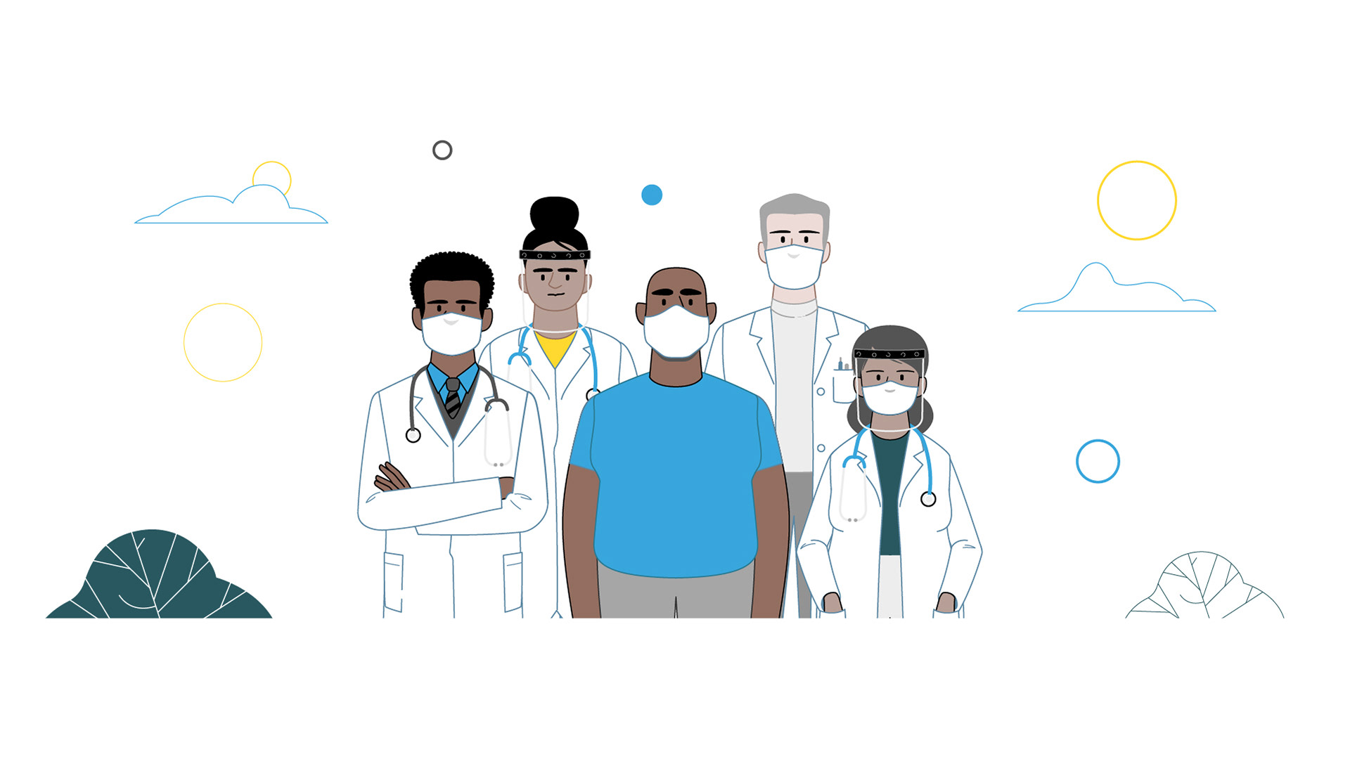
During 2020, the Socialisssima agency required us for the Covid-19 Prevention Network project: a Prevention Network created by the United States National Institutes of Health (NIH) to recruit volunteers for COVID-19 vaccine studies.
The goal of the campaign was more than ambitious: to recruit 30,000 volunteers per study in several countries, and in record time. The communication challenge was key, as we needed to bring participants of all ethnicities together to reach a number that reflected the percentages of the Hispanic and African-American population in the US.
We had to challenge, convene, educate, and above all bring clarity to a target that could have doubts and resentments.
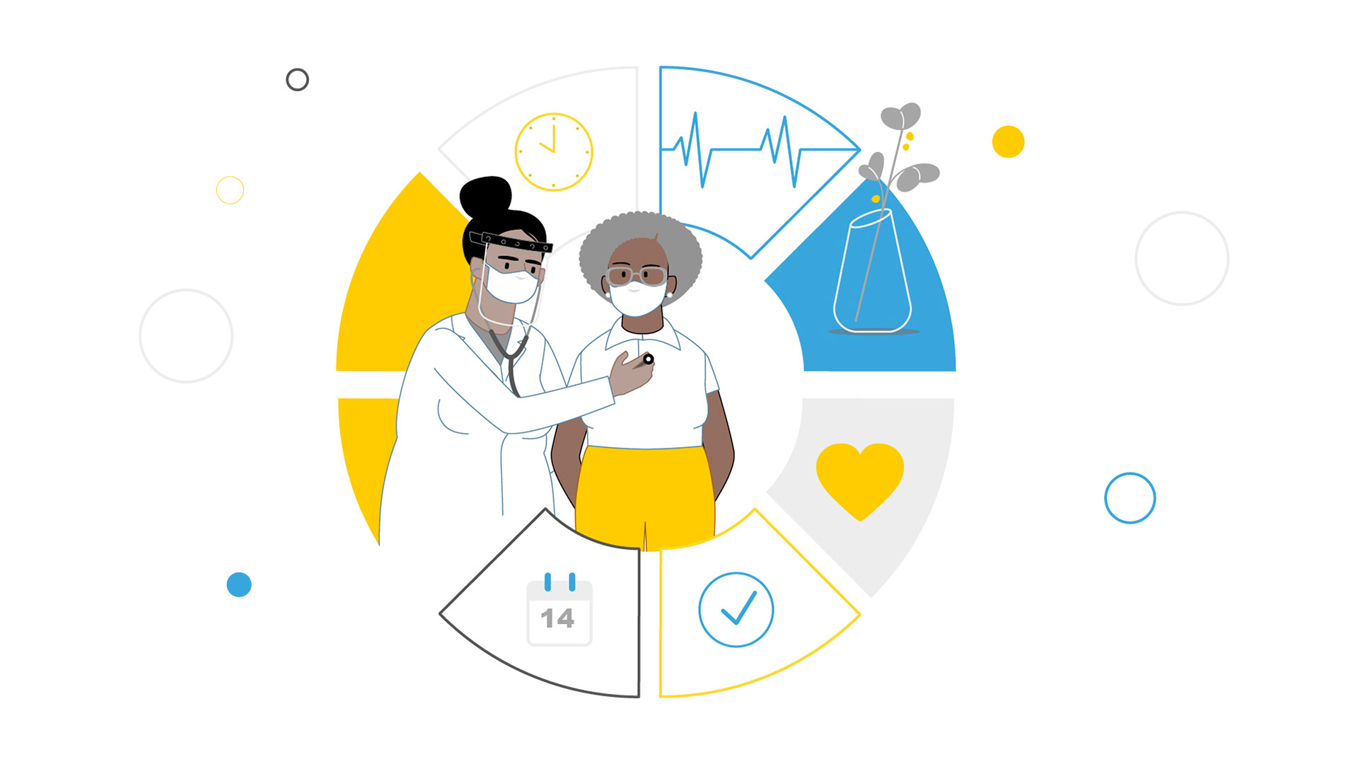
Como parte de la campaña, la agencia Socialisssima planteó un set de videos educativos que dieran respuesta a las preguntas y prejuicios más frecuentes que podían condicionar al potencial voluntario: si decido participar en los testeos… ¿seré un conejillo de indias?, ¿me contagiaré el virus?, ¿podré abandonar el estudio?
Al tratarse de múltiples audiencias con etnias y backgrounds socioculturales diferentes, el mensaje, ante todo, debía ser claro y directo, generando empatía dentro de un lenguaje ilustrado. Por experiencia sabemos que la animación infográfica es una herramienta eficaz para piezas educativas. Pero como contrapartida también sabemos que existe una delgada línea donde manejarse, de la cual se puede caer en una desconexión entre el recurso formal y el mensaje. En nuestro caso el universo morfológico debía contemplar una idea que balanceara simplicidad y generalidad.
Al tratarse de múltiples audiencias con etnias y backgrounds socioculturales diferentes, el mensaje, ante todo, debía ser claro y directo, generando empatía dentro de un lenguaje ilustrado. Por experiencia sabemos que la animación infográfica es una herramienta eficaz para piezas educativas. Pero como contrapartida también sabemos que existe una delgada línea donde manejarse, de la cual se puede caer en una desconexión entre el recurso formal y el mensaje. En nuestro caso el universo morfológico debía contemplar una idea que balanceara simplicidad y generalidad.
As part of the campaign, the Socialisssima agency proposed a set of educational videos that answered the most frequent questions and prejudices that could condition the potential volunteer: If I decide to participate in the tests... will I be a guinea pig? Will I get the virus? Will I be able to leave the study?
To deal with multiple audiences with different ethnicities and sociocultural backgrounds, the message, above all, had to be clear and direct, generating empathy within an illustrated language. We know that infographic animation is an effective tool for educational pieces. But on the other hand, we also know that there is a thin line to handle, so as not to fall into a disconnection between the formal resource and the message. In our case, the morphological universe must contemplate an idea that could balance simplicity and generality.
To deal with multiple audiences with different ethnicities and sociocultural backgrounds, the message, above all, had to be clear and direct, generating empathy within an illustrated language. We know that infographic animation is an effective tool for educational pieces. But on the other hand, we also know that there is a thin line to handle, so as not to fall into a disconnection between the formal resource and the message. In our case, the morphological universe must contemplate an idea that could balance simplicity and generality.


La receta, a priori, se veía clara: mantenerse en lo simple. Lo cual, paradójicamente, suponía un esfuerzo superior, ya que la aparente simpleza implica un trabajo gigante por detrás.
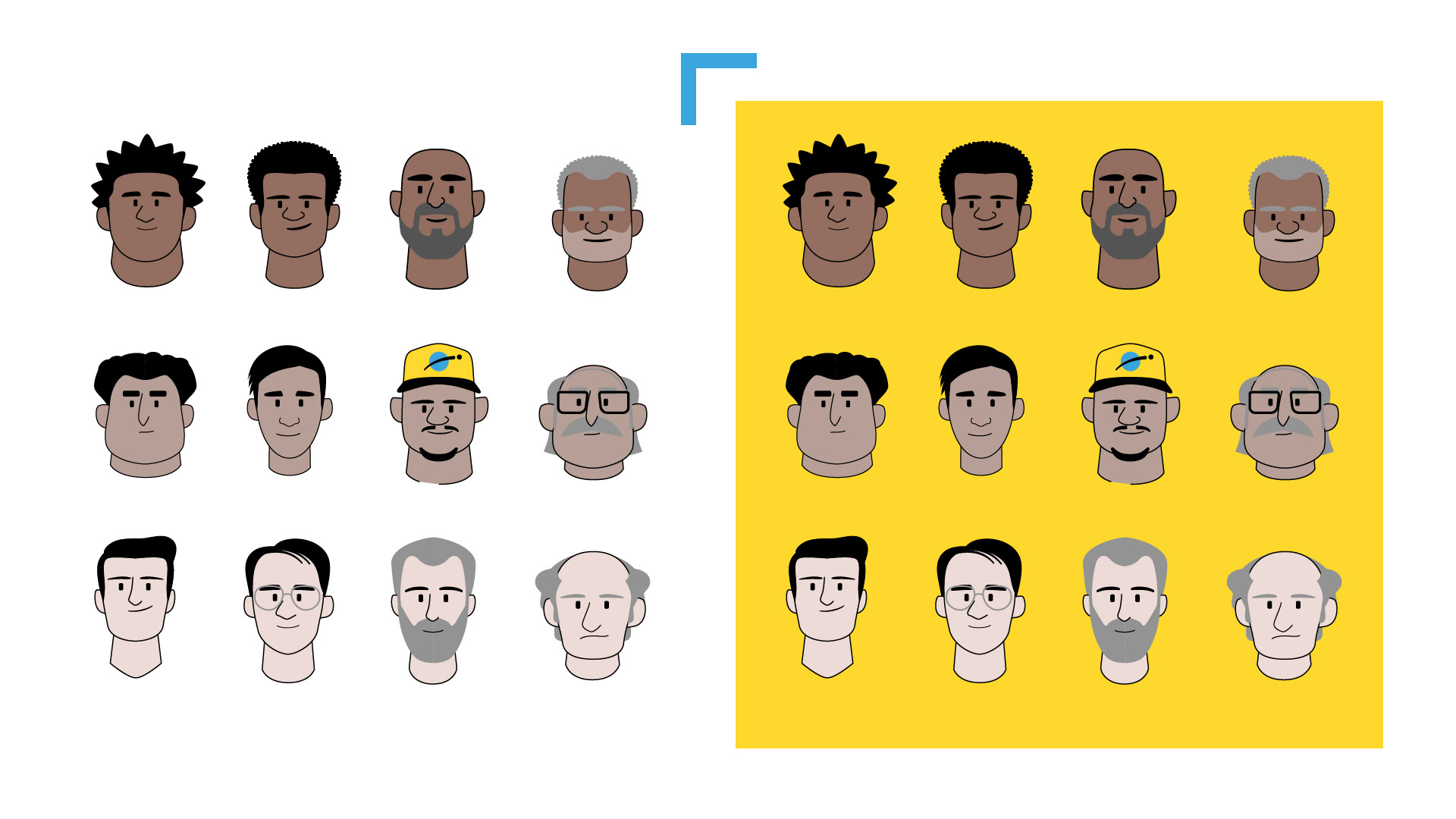
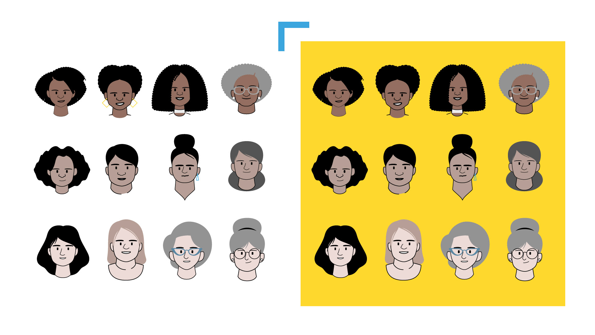
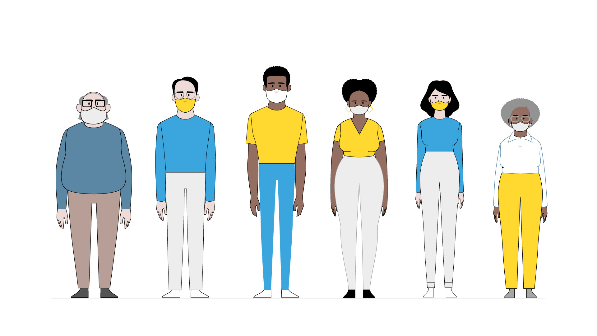
Debíamos trabajar —y trabajamos— duro en pos de una línea de ilustración que, dentro de la simpleza, pudiera abarcar la multiculturalidad, y que generara empatía en cada uno de los potenciales espectadores. El proceso de ilustración fue intenso al comienzo, ya que debíamos generar el estilo identitario de toda la campaña. Una paleta reducida de color, líneas simples, personajes con un sutil nivel de detalle que nos permitiera comunicar diversidad sin abandonar la simpleza, y sobre todo, generar la tan buscada empatía.
Sabíamos que una gran parte de nuestra audiencia serían personas mayores, con lo cual los cuadros de texto debían guardar también simpleza y contundencia, casi con la misma pregnancia de una señal de tránsito o de comunicación en la vía pública donde no se puede perder el tiempo en distracciones.
The recipe, a priori, was clear: keep it simple. Which, paradoxically, supposed a superior effort, since the apparent simplicity implies a giant work behind the scenes. We had to work — and we work — hard in pursuit of a line of illustration that, within simplicity, could reach multiculturalism, and that would generate empathy in each of the potential viewers. The illustration process was intense at the beginning, since we had to generate the global identity style of the entire campaign. A reduced color palette, simple lines, characters with a subtle level of detail that allow us to communicate diversity without abandoning simplicity, and above all, generate the desired empathy.
We knew that a large part of our audience would be older people, so the text boxes should also be simple and forceful, with almost the same importance as a traffic sign where time cannot be wasted in distractions.
We knew that a large part of our audience would be older people, so the text boxes should also be simple and forceful, with almost the same importance as a traffic sign where time cannot be wasted in distractions.
Una vez desarrollado el estilo global de ilustración, debíamos llevar los mismos conceptos al campo del movimiento, para que la animación reflejara esta línea. Personajes conviviendo en espacios neutros y claros, no distractivos, con movimientos tranquilos y suaves, que llevaran al frente la comunicación del contenido, sin caer en lo que se podría llamar la "distracción del movimiento”.
Originalmente, la campaña tenía como audiencias a las comunidades negras, latinas, afros y navajas, las que habían sido más impactadas por el virus dentro de USA. La respuesta y el resultado fueron tan buenos que rápidamente el formato se exportó a otros países: Sudáfrica, Perú, Brasil.
Hoy, casi un año después, podemos decir que en este proceso aprendimos, crecimos, y entendimos que nuestro trabajo como profesionales de la comunicación a veces tiene más sentido del que pensamos.
Once the illustration global style was developed, we had to bring the same concepts to the movement universe, so that the animation could reflect that style. Characters coexisting in neutral and clear spaces, not distracting, with calm and smooth movements, which will bring the content to the foreground, without falling into what could be called the "distraction of movement".
Originally, the campaign had as target audiences the Black, Latino, Afro and Navajo communities, which had been most impacted by the virus in the US. The result was so good that the format was quickly exported to other countries: South Africa, Peru, Brazil.
Today, almost a year later, we can say that in this process we learned, grew, and understood that our work as communication professionals sometimes makes more sense than we think.