
Socialisssima
Covid-19 Prevention Network
Brief
En pleno 2020, la agencia Socialisssima, nos convocó para el proyecto Covid-19 Prevention Network: Una Red de Prevención creada por el Instituto Nacional de Salud de los Estados Unidos (NIH) para reclutar voluntarios para los estudios de la vacuna del COVID-19.
El objetivo de la campaña era más que ambicioso: reclutar 30.000 voluntarios por estudio en varios países, y en tiempo récord. El desafío de la comunicación era clave, ya que debíamos convocar a participantes de todas las etnias para alcanzar un número que reflejara los porcentajes de población hispana y afroamericana en EE.UU.
Debíamos interpelar, convocar, educar, y sobre todo llevar claridad a un target que podía mostrarse con dudas y resquemores.
Solución
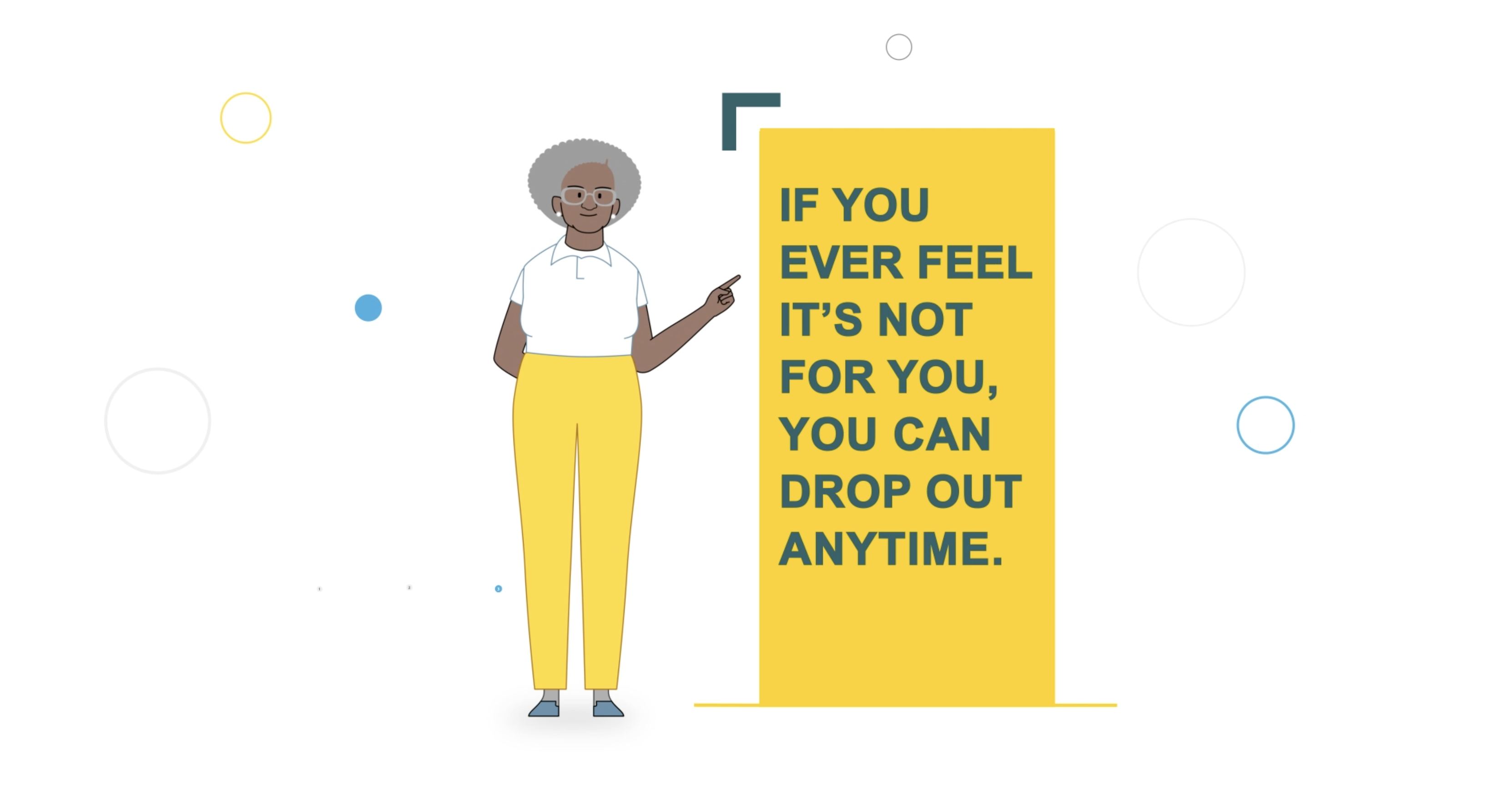
Como parte de la campaña, la agencia Socialisssima planteó un set de videos educativos que dieran respuesta a las preguntas y prejuicios más frecuentes que podían condicionar al potencial voluntario: si decido participar en los testeos… ¿seré un conejillo de indias?, ¿me contagiaré el virus?, ¿podré abandonar el estudio?
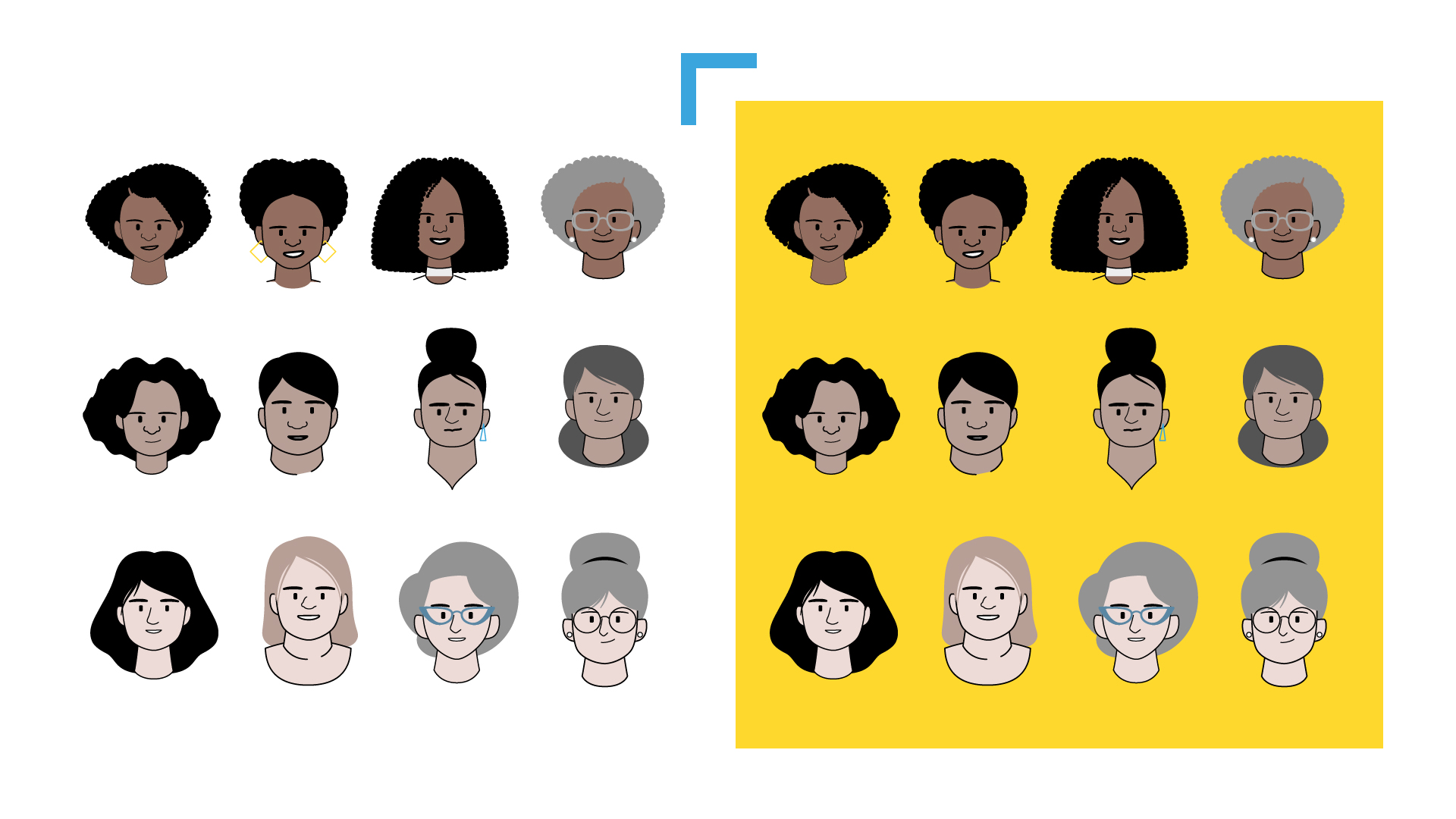
Al tratarse de múltiples audiencias con etnias y backgrounds socioculturales diferentes, el mensaje, ante todo, debía ser claro y directo, generando empatía dentro de un lenguaje ilustrado. Por experiencia sabemos que la animación infográfica es una herramienta eficaz para piezas educativas. Pero como contrapartida también sabemos que existe una delgada línea donde manejarse, de la cual se puede caer en una desconexión entre el recurso formal y el mensaje. En nuestro caso el universo morfológico debía contemplar una idea que balanceara simplicidad y generalidad.
La receta, a priori, se veía clara: mantenerse en lo simple. Lo cual, paradójicamente, suponía un esfuerzo superior, ya que la aparente simpleza implica un trabajo gigante por detrás.
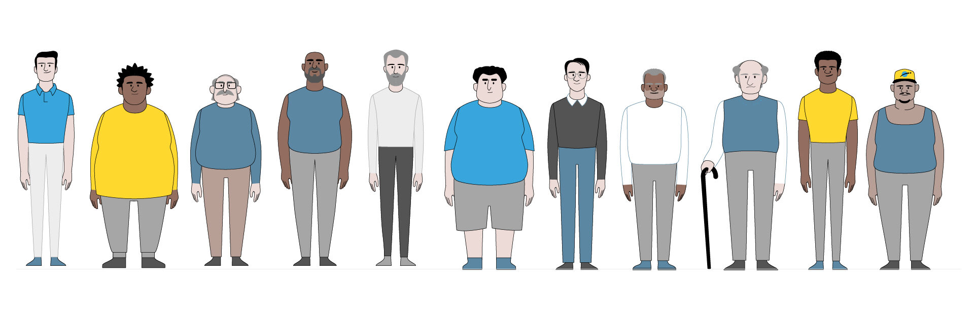
Debíamos trabajar —y trabajamos— duro en pos de una línea de ilustración que, dentro de la simpleza, pudiera abarcar la multiculturalidad, y que generara empatía en cada uno de los potenciales espectadores. El proceso de ilustración fue intenso al comienzo, ya que debíamos generar el estilo identitario de toda la campaña. Una paleta reducida de color, líneas simples, personajes con un sutil nivel de detalle que nos permitiera comunicar diversidad sin abandonar la simpleza, y sobre todo, generar la tan buscada empatía.
Sabíamos que una gran parte de nuestra audiencia serían personas mayores, con lo cual los cuadros de texto debían guardar también simpleza y contundencia, casi con la misma pregnancia de una señal de tránsito o de comunicación en la vía pública donde no se puede perder el tiempo en distracciones.
Una vez desarrollado el estilo global de ilustración, debíamos llevar los mismos conceptos al campo del movimiento, para que la animación reflejara esta línea. Personajes conviviendo en espacios neutros y claros, no distractivos, con movimientos tranquilos y suaves, que llevaran al frente la comunicación del contenido, sin caer en lo que se podría llamar la “distracción del movimiento”.
Originalmente, la campaña tenía como audiencias a las comunidades negras, latinas, afros y navajas, las que habían sido más impactadas por el virus dentro de USA. La respuesta y el resultado fueron tan buenos que rápidamente el formato se exportó a otros países: Sudáfrica, Perú, Brasil.
Hoy, casi un año después, podemos decir que en este proceso aprendimos, crecimos, y entendimos que nuestro trabajo como profesionales de la comunicación a veces tiene más sentido del que pensamos.